The Psychology Behind A Restaurant Menu Design
Many diners don’t realize it, but the moment they enter your restaurant they are being guided to open a menu. Most diners don’t realize it, but from the moment they open a menu, from font and color to placement and pricing is designed to subtly guide what they order and how much they spend. That’s the power of strong menu design.
More Than Just a List of Dishes
Most diners don’t realize it, but they’re being guided the moment they open a menu. From font size and color to dish placement and pricing, every detail is designed to influence their decisions — subtly shaping what they order and how much they spend. That’s the power of psychology in menu design.
Eye Movement & Menu Scanning Patterns
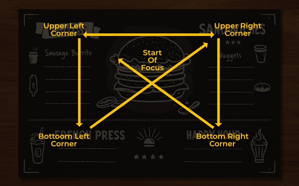
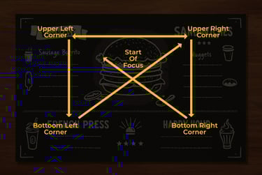
People don’t read menus like books. Studies show diners follow predictable visual patterns — like the Golden Triangle, where the eyes move from the center to the top-right, then top-left. Smart design places high-margin or signature dishes right where the eyes land first.
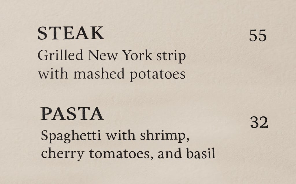
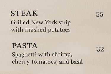
Decoy Pricing
Strategically placing a premium item at the top of a section can make other dishes feel affordable.
Example: A $55 steak sitting next to a $32 pasta, the pasta suddenly seems like a “deal.” This is known as anchoring, the higher-priced item makes others feel more reasonable by comparison.
Descriptive Language
Using se storytelling to evoke taste, nostalgia, or exclusivity — especially for house specials. Menus that use emotional, or origin-based language can potentially increase sales by up to 27%.
Example: “Grilled Chicken” becomes “Fire-Grilled Citrus Herb Chicken inspired by Grandma Lucia’s Sunday recipe.”
Color to Set the Mood
Matching your menu’s color palette to your menu creates an emotional tone and keeps your
brand consistent.
Colors are not just for looks, they influence appetite and perception. Red and yellow can stimulate hunger (hello, fast food). Green implies freshness. Black or gold suggests luxury.
Decision Speed
Less is more. Prioritize dishes that align with your identity and drive the most profit.
Too many options can overwhelm your customers. There is a phenomenon called decision fatigue. The best menus are organized into clear, digestible sections with 7 items or fewer per category that will help the viewer make a quick decision and make you more money.
The Power of Negative Space
White space isn't wasted space. It helps important items stand out, improves readability, and makes the overall design feel elevated.
Tip: Don’t crowd your menu. Space out sections to guide the eye and keep things visually clean.
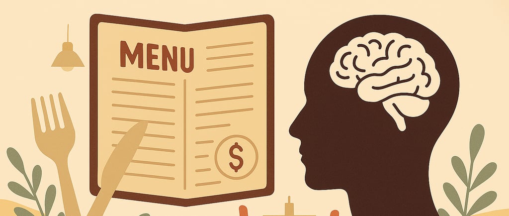
Removing Dollar Signs = Boosted Spending
By simply removing the dollar sign from "$14" to "14" can lead customers to spend more. This simple change can the customer feel less like they are spending money and more like part of the experience.
Tip: Keep your pricing subtle and avoid columns that encourage diners to price-shop.
In Conclusion:
When it boils down to it designing a menu is more about looking good, it is a tool to influence behavior. When you combine psychology and design you can craft an experience that leaves a lasting impression for your customers.
If you are a restaurant owner that is looking to elevate their brand through strategic design, I’d love to help.
Schedule a Free Consultation Today!