Massimo’s Pizza rebrand identity
The Solution
The goal was to create a mini brand refresh that honored Massimo’s legacy while making it relevant and appealing to today’s audience.
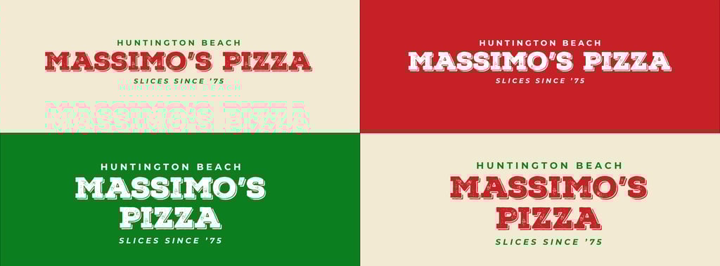
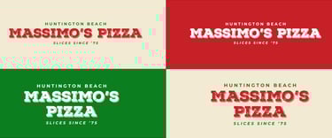
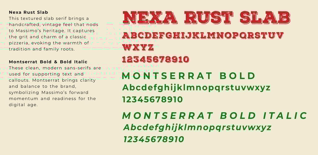
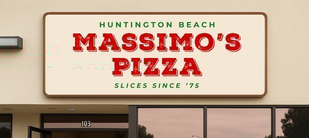
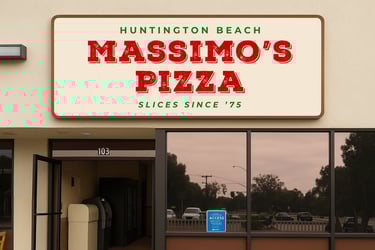
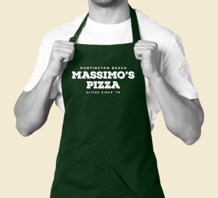
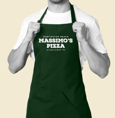
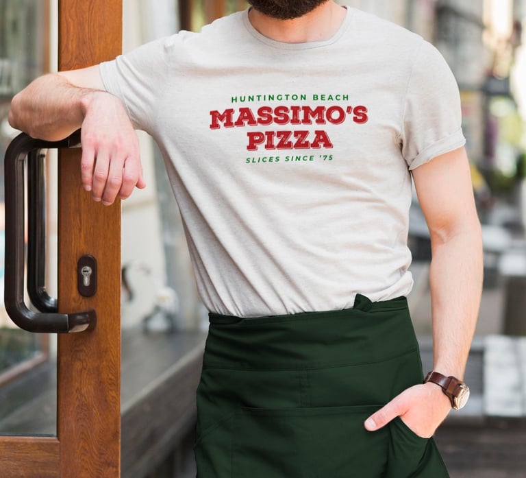
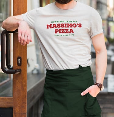
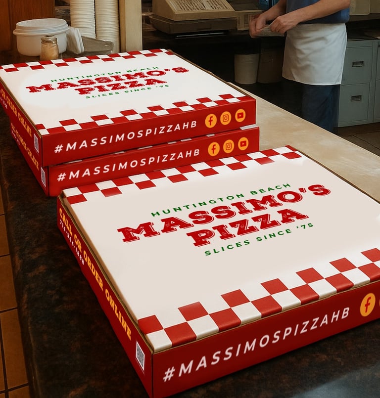
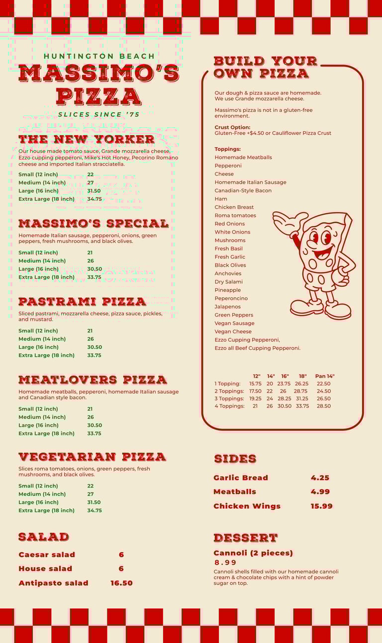
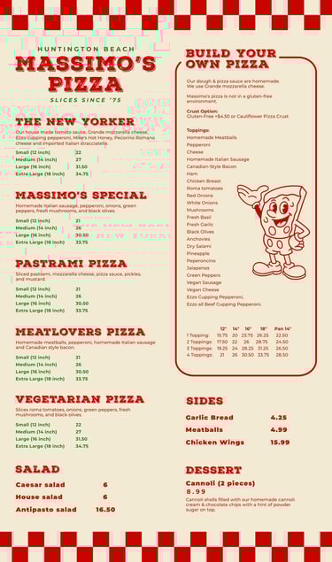
A new logo was introduced using vintage-inspired typography
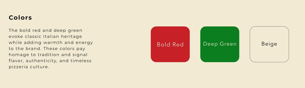
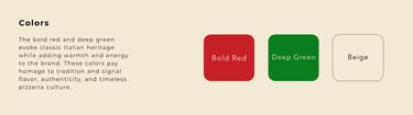
and a bold layout to reflect their New York-style roots and longstanding local presence.A color palette of deep green and bold red added warmth and
a nostalgic Italian-American vibe.Fonts were selected to bridge eras: Nexa Rust Slab for tradition, Montserrat for a modern, digital-ready look.
The brand voice was clarified as bold, welcoming, and
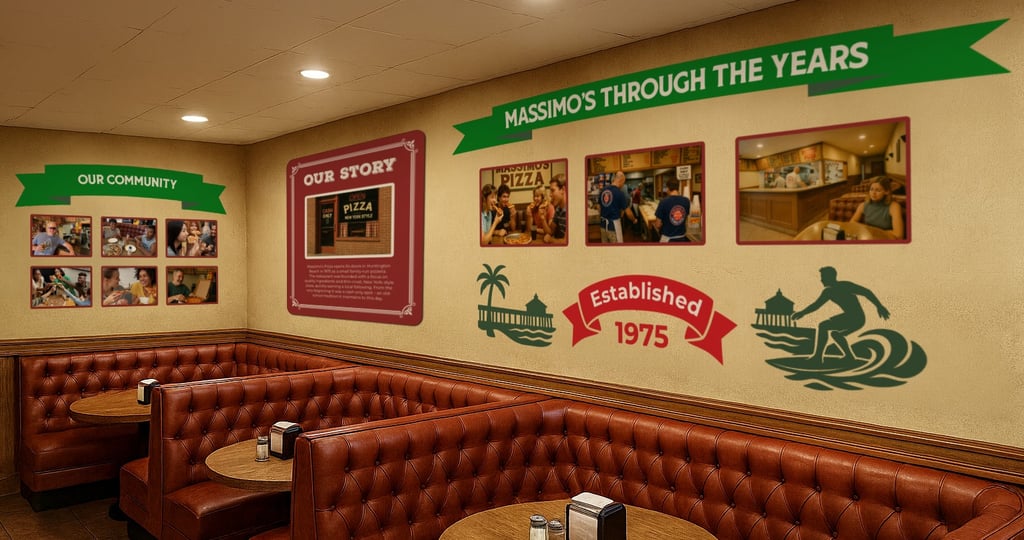
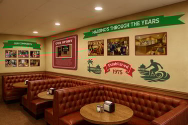
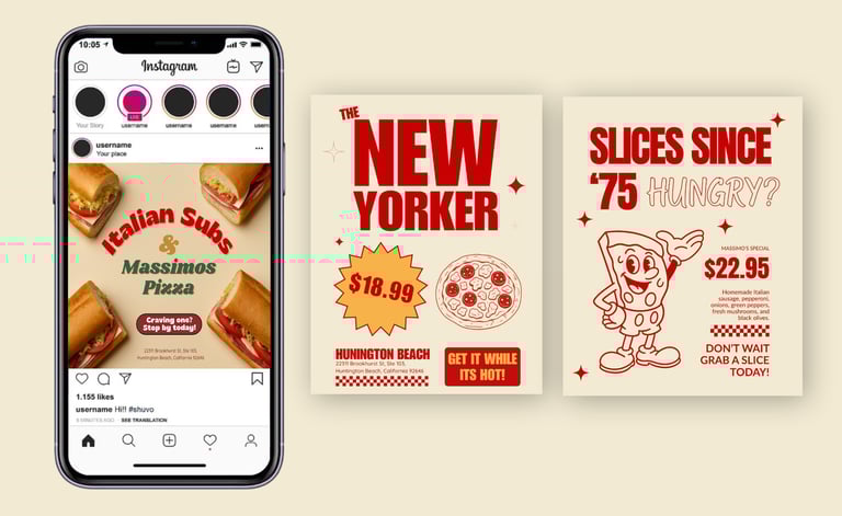
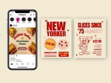
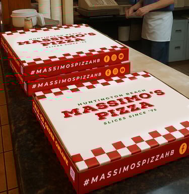
no-nonsense personality that felt true to Massimo’s.Branded social media graphics, pizza box packaging, and promotional materials were developed to show real-world applications of the refreshed brand.
The Result
The rebrand identity gave Massimo’s Pizza a more consistent, memorable, and professional look that reflects their heritage while positioning them for growth.
With a clear voice and consistent visuals, Massimo’s now stands out both in-store and online, reconnecting with longtime regulars and attracting new customers eager for a slice of something authentic.
The Challenge
Massimo’s Pizza, a long-standing local favorite in Huntington Beach, has strong roots but an outdated brand identity. Their existing logo lacked personality, and their visuals didn’t reflect the energy or story behind the restaurant. Despite having great food and loyal customers, their branding failed to stand out in a crowded market or connect with newer audiences online and in-store.

Let's Tell Your Restaurant's Story
Turn passion into profit with strategic, story-driven design.